A diagram representing the frequency distribution of continuous data grouped by means of class intervals. It consists of a sequence of rectangles, each of which has as its base one of the class intervals and is of a height taken so that the area is proportional to the frequency. If the class intervals are of equal lengths, then the heights of the rectangles are proportional to the frequencies.
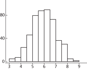
The figure shows a histogram of a sample of 500 observations. Compare bar chart.
A histogram
A diagram representing a sample of numerical data, in which rectangles are used to represent frequency. It differs from the bar chart in that the rectangles may have differing widths, but the key feature is that, for each rectangle, the area is proportional to the frequency represented. The term ‘histogram’ was introduced by Karl Pearson in his lectures in 1891.
http://nlvm.usu.edu/en/nav/frames_asid_145_g_4_t_5.html Applet.
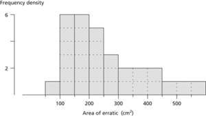
Histogram. This histogram represents data on the cross-sectional area of 30 erratics (boulders left behind by retreating glaciers). Note the use of wider intervals for the classes corresponding to the scarcer larger boulders. In a histogram, area is proportional to frequency.
A statistical graph that uses the height of a column to represent the number of occurrences or frequency in a particular class of results that arise from an experiment or sample.
A chart showing the relative frequencies with which a measurable quantity takes values in a set of contiguous intervals. The chart consists of rectangles whose areas are proportional to the relative frequencies and whose widths are proportional to the class intervals. It can be used to picture a frequency distribution.
A frequency graph in which the data range is divided into bins.
A graphical representation of a table showing the frequencies or proportions of observations falling in each of several specified categories, usually the sub-intervals (bins) of the range of observed values. It is the simplest non-parametric estimate of the population distribution of the variable under consideration.
- contrast ratio
- contrasts
- contrast stretching
- contravariant functor
- contravariant tensor
- contributory pension scheme
- control
- control bus
- control character
- control chart
- control charts
- control circuitry
- Control Commissions
- Control Data Corporation
- control design
- control electrode
- control element
- control flow
- control-flow graph
- control grid
- control group
- control key
- controlled-carrier modulation
- controlled crash
- controlled sharing