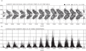
A graph on which the latitudes of sunspots are plotted against time. It shows how spots migrate from higher latitudes (30–40° north or south) towards the equator (latitude 5° or so) throughout each sunspot cycle, in accordance with Spörer’s law. The shape of the distributions, when plotted for both northern and southern hemispheres, resembles the wings of a butterfly.
butterfly diagram:

(a) Butterfly diagram for sunspots from 1874, and (b) corresponding plot of the total area covered by sunspots, measured as a percentage of the visible hemisphere.
 http://solarscience.msfc.nasa.gov/images/bfly.gif Regularly updated version of the diagram from NASA’s Marshall Space Flight Center.
- spray dryer absorbers
- spray pyrolysis
- spread
- spread effect
- spreading
- spreading rate
- spreading resistance
- spreadsheet
- spread spectrum
- spread spectrum signalling
- SPREE
- spreiten
- Spriggina
- spring
- spring balance
- springbok
- spring constant
- spring equinox
- Springerian
- Springer, Robert Clyde (1942– )
- Springfield mounting
- spring sapping
- Spring, Sherwood Clark (1944– )
- spring tide
- SPRINT-A