A graphical method for displaying data that is an alternative to the bar chart for displaying data on a discrete random variable, and an alternative to the histogram as a method of approximating the graph of a probability density function.
Suppose a set of discrete numerical data consists of the observed value x1 with frequency f1, the observed value x2 with frequency f2, and so on. The frequency polygon consists of the straight line segments joining the points with coordinates (x1, f1), (x2, f2),⋯. It is conventional to start and finish the polygon on the x-axis at appropriate points.
In the case of grouped numerical data with classes of equal width d, say, the frequency polygon consists of the straight-line segments joining the points with coordinates (x1, f1), (x2, f2),⋯, (xn, fn), where x1, x2,⋯, xn are now the midpoints of the class intervals and f1, f2,⋯, fn are the corresponding class frequencies. The polygon starts at (x1−d, 0) and finishes at (xn + d, 0). A suitable change of scale gives the relative frequency polygon. As n increases and d decreases, the relative frequency polygon approaches the graph of the corresponding probability density function.
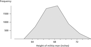
Frequency polygon. This polygon illustrates the frequencies of the heights of 5 732 Scottish militiamen in 1 817.
- Sentinel
- sentinel
- Sen–Puri test
- SEO
- SEOSat/Ingenio
- SEPA
- sepal
- separable first-order differential equation
- separable(of a function)
- separable(of a space)
- separable solution
- separable utility function
- separate confinement heterostructure laser
- separated sets
- 100 per cent gold backing
- 10/100/1000 Base-T
- 10 Base 2
- 10 Base 5
- 10 Base FX
- 1,2-diaminoethane
- 1,2-dibromoethane
- 1,2-didehydrobenzene
- 1,2-dihydroxybenzene
- 12-D process
- 1,2-propadiene