A graphical representation of the absolute magnitude of stars (usually along the y-axis) plotted against the spectral class or colour index (x-axis). The y-axis then represents the energy output of the star and the x-axis its surface temperature. The majority of stars on such a diagram fall on a band running from the top left to the bottom right of the graph. These are called main-sequence stars (the sun falls into this class). The few stars falling in the lower left portion are called white dwarfs. The giant stars fall in a cluster above the main sequence and the supergiants are above them. The diagram, which was first devised in 1911 by Ejnar Hertzsprung (1873–1969) and in 1913 by Henry Norris Russell (1897–1957), forms the basis of the theory of stellar evolution.
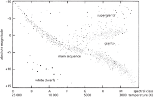
Hertzsprung–Russell diagram.
A graph on which a measure of the brightness of stars (usually their absolute magnitude) is plotted against a measure of their temperature (either spectral type or colour index). The diagram shows how the luminosities and surface temperatures of stars are linked. From a star’s position on the diagram, astronomers can estimate its mass and the stage of its evolution.
Most stars lie on the main sequence, a strip which runs from the upper left to the lower right of the diagram. A star on the main sequence is burning hydrogen in its core, and during this phase of its life will remain at a point on the diagram that is determined by its mass. Other areas of the HR diagram are populated by stars that are not burning hydrogen in their cores, but may be burning hydrogen in a thin shell. The most prominent of these areas is the giant branch, consisting of stars which have exhausted the hydrogen fuel in their cores. Other features are the strips occupied by supergiants, with luminosities 300 to 100 000 times that of the Sun, and white dwarfs, dying stars with luminosities typically 10 000 times less than the Sun’s. Theories of stellar evolution must explain the various features of the HR diagram. It is named after H. N. Russell and E. Hertzsprung, who independently devised it. See also colour–luminosity relation; colour–magnitude relation.
Hertzsprung-Russell diagram:
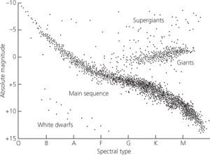
Hertzsprung–Russell diagram for stars in the Sun’s vicinity.
- Academy
- Academy of Athens
- Academy of Florence
- Acadian orogeny
- Acado-Baltic Province
- Acamar
- acanthite
- acanthodians
- Acanthodii
- Acanthograptidae
- Acanthostega
- Acarina
- acatalepsy
- accelerant
- accelerated depreciation
- accelerated graphics port
- accelerated life test
- accelerating anode
- accelerating electrode
- acceleration
- acceleration due to gravity
- acceleration, gravitational
- acceleration of free fall
- acceleration phase
- acceleration, secular